Monday, July 25, 2011

The Lamps Are Bases


Well, the photos from the iPhone don't do these justice, and neither do the cheap lamp kits I bought. I need better lamp kits and I'm going to have a bit of difficulty finding shades that make me happy. A few people have suggested that I need to make my own shades, and I think they may be right. The cheap lamp kits seemed fine, until these were done. Now the cheap brass looks cheap and shiny.

I will definitely make more, once I figure out better lamp kits.

The flowers are forget-me-nots and orange blossoms with a little liberty on colors. I wanted romantic, loving flowers for our bedroom, but orange blossoms are actually white. I "upped" the color a bit to make them prettier. The forget-me-nots are a little more purple than they would be in real life, but not as purple as the photo makes them seem. The blue sky spray really turned out exactly as I would have wanted it.

Questions? Comments?

Thursday, July 21, 2011

Twisty Vase

twisty vase on table
twisty vase in window

This is the second in a series of "twisty" vases. I wanted to do a twisty vase, but my teacher convinced me out of the idea, and instead I created a vase that was a cylinder with applied twists that reminded me of seaweed. I should probably take photos of that one and post it too, even though it was a while ago.

Still, I wanted a truly twisted vase, where I made a cylindrical vase and then twisted it physically. It was kind of a hilarious process, since it turned out my hands weren't strong enough to twist the clay once it was a cylinder, I ended up putting it between my knees, which held the vase still, while twisting the cylinder with my hands.

The first attempt was actually a disaster -- I twisted too much at the bottom and the whole thing collapsed. The second time, I used a cardboard cylinder in the middle of my clay cylinder and twisted carefully from top and bottom, a little at a time.

To glaze, I sprayed on a dark blue, scraped off the glaze at the curvy bits, sprayed a cream-colored glaze there, and then sprayed with a dark, olive green to give it the speckled texture. Please zoom in on the glaze. It turned out really cool. Thanks to my glaze guru at Brickhouse!

Monday, July 18, 2011

Tile "Quilt"


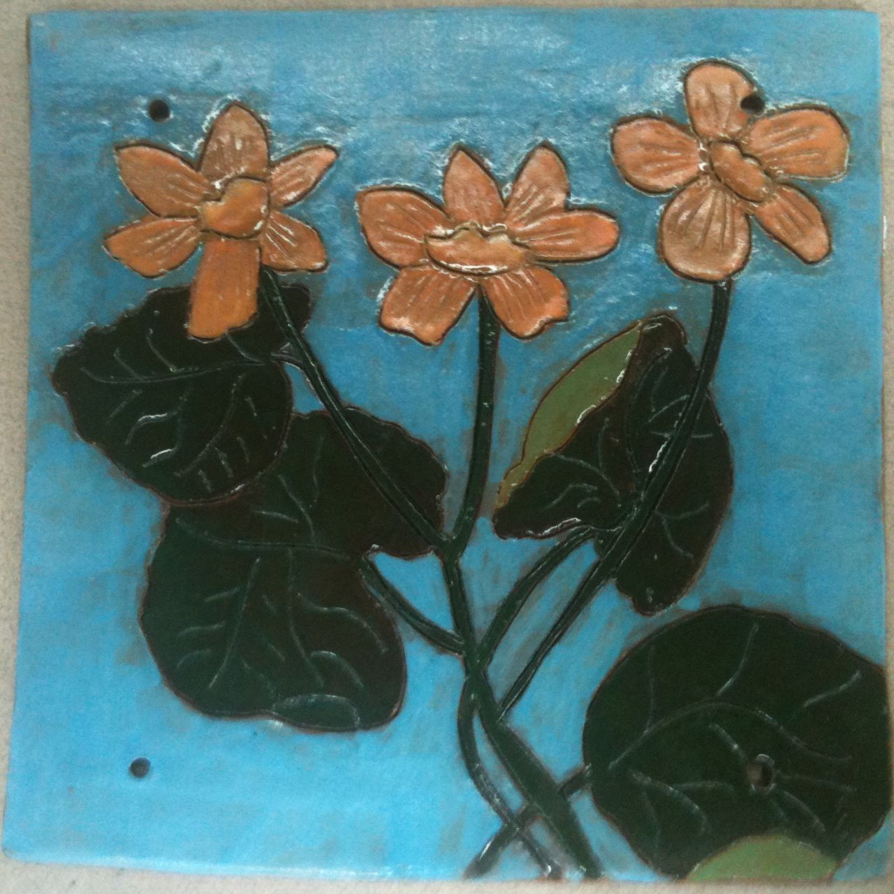
I made these tiles because I envisioned a "quilt" of ceramic tiles. Despite the constant reminder from my hand-building teacher, who wanted me to apply a white porcelain slip before carving and painting, I left them "clay" colored for painting. I really wanted them to look like clay pieces, not watercolors or cloth or anything else. I made the tiles large (8"x8") and very thin.

The idea was to have a 3x3 grid of tiles, tied together with leather shoelace-like string, and put in a slightly rustic "Arts and Crafts" like frame. After I made 11 tiles, the people at the studio looked through them and decided that this group "goes together." You can see the stack of other tiles in the top right corner of the photo in which I attempted to capture the layout (wow, the iPhone and I are not a good combination for good photos). My teacher came up with the idea that I stagger them, as seen in the last photo. I would place them in two rows, staggered, to create a 2x6 grid, or really a 2x12 grid, with every other space being blank.

I had several problems in my grand vision. First, the "sky blue" -- actually called turquoise by the underglaze manufacture -- burnt out a little bit in the kiln, leaving some obvious tile showing through, and some obvious brush strokes. Second, I applied a little heavily the green glaze that I used to make an underwater effect on the octopus and starfish. Third, I didn't apply the same glaze to the fish, which is problematic since it is also underwater.

I think I will do another project like this, making the tiles smaller (maybe 6"x6") and applying porcelain slip to the tiles. I also want to figure out how to spray the sky or water on before making the rest of the composition, or by applying wax to the rest of the composition, so that I avoid uneven brushstrokes.

These are horrible photos, so I don't think that anyone will see the success here. I think I will finish the composition with a frame and take a proper photo with a real camera because, honestly, there is a lot to love with these also.

Friday, July 15, 2011

Got Fish?

I'm taking a silkscreen class at the School of Visual Arts. This is the third class (and the first class we bought our stuff and taped our screens -- a very expensive waste of time).

Today, I revisited the "Got Fish?" idea with a photo of Snoopy taken when we were in Jakarta, Indonesia. I did the layers in Photoshop and added "Got Fish?" in the same font that the "Got Milk?" advertisement used. I tried making each layer large enough to overlap slightly, and printed four layers -- one for each color.

I put two layers on each silkscreen, since I only have two screens. I now realize that I should have put them together 1 and 3, 2 and 4, so that I didn't have to wait for the screen to dry between colors. A lot of time is eaten by waiting for your screen to dry.

The first layer is pink (just the inside of his ears). The second is a bright, light orange. The third is a dark orange, and the fourth is the black. I have yet to figure out how to line everything up perfectly. When I'm lining the screen up to the original, it looks perfect. When I push the ink through, it's obvious it's not.

I was okay with the lack of alignment until the black layer, when I tried to fix it midstream. Fixing it midstream is probably even more difficult than aligning it properly before printing, but the black ink made it impossible. Since I was already tired, I decided to clean the screen and come home. I will try to do it right next week. The question is whether I have to redo the Photoshop files to build in better overlap, or whether I just need help determining why I'm not good at getting the registration aligned.

Anyway, he's still cute.


Note: I took this with the iPhone in the studio, so the colors aren't true.

Thursday, July 14, 2011

The Lamps Are Glazed


I began these lamps some time ago. I knew we needed lamps for our bedroom (we have one dented IKEA thing right now), so I figured I should make some. I knew I wanted to make slab-built pieces with an uneven number of sides (there are five, which you can't see because of my bad iPhone photo). So, I went to Brickhouse and made a model from cardboard -- actually, a Priority Mail box. It was a little too short at first, so I just cut it longer and then wrote on the cardboard how long that was. It was all a little off-the-cuff, so I was nervous. I sprayed them with porcelain slip to make them white.

Well, my teacher for hand-built work encouraged me to hand paint them, so I went home and came up with some floral ideas. I went back the next day and carved out each design with a pencil (really, a pencil), which will look darker since you will see some clay color where the lines are. Then, I hand painted the colors on with underglaze. Then, because I got a crazy idea (after painting the flowers) that a little blue behind would make a good sky background, I waxed over the flowers and sprayed a light-blue underglaze lightly all over the lamps.

So, today, they came out of the bisque kiln. In order to attempt to get the affect I want, I hand painted clear glaze on the flowers and then waxed them again, so that I could spray another mixture of clear and faux celadon glaze over the whole thing in the hopes that it will have an even more amazing "sky" look. They are waiting to go into the glaze kiln now.

Note: the one in the front has no glaze on the flowers yet, the one in the back has hand-painted clear glaze blocking the colors.

Tuesday, July 12, 2011

Silkscreen Class Week Three

I haven't posted my first prints, but this is the second round. I took a photo from our wedding and I took a photo that I arranged of my husband's and my shoes by the bench at the door. The first is obviously "Wedding." The second I titled "Marriage." I decided to do them together as a piece.

I edited them in Photoshop to make them both black and white and textural. Then, I placed them one over the other and used my own handwriting font to add the titles. I selected the black and white and made them separate layers, so that I could separate the layers with the silkscreen. I mixed an aqua green and a deep blue-purple as my two inks. When I attempted to line up the registrations, I had great difficulties. This was the result:


As you can see, the white of the paper comes through the two inks. My gut reaction was that I actually liked it that way -- that it gave the print depth. However, the manager of the print studio commented that I could have made color blocks for the background to avoid the gaps. Further, the professor spent many minutes trying to help me get it to line up perfectly, explaining that the colors should overlap slightly. So, I trashed the emulsions and tried again.

This time, I made color blocks (huge black rectangles in Photoshop) and used them to print the aqua green. I then used the images to print the purple over those blocks:


I don't like it as much. This whole project took from 10 a.m. to 8 p.m. with one break for lunch, which made it exhausting being on my feet the whole day.

One of my fellow students would like me to "ghost" the wedding over the "marriage" in colors that will combine for a third color. I may try that next. I may "grow" the two layers so that they overlap properly instead of doing blocks. I may move onto another print for now and think about how I would do it best.

I kind of think that people would find this print amusing enough to want one. That would be nice.

Animated GIF

Since I haven't had time to take photos of the prints that I made on Friday, I decided to post this small tribute to my father-in-law, the late Gregory Cenzer, and his Chevy SSR. The idea for posting this is thanks to Anil Dash, a man whom I do not know but I read regularly, who posted "Animated GIFs Triumphant." Although I realize this is a tiny GIF rather than a silent film, it was done to be his avatar. Since it was my first animated GIF from high-resolution photos and it has 53 slices, it was too big to be an avatar at nearly 500KB. I may redo it to make a larger silent film later today.

Here it is:

Chevy SSR

He demonstrated for my husband and me the top going down while we took photos. I made the animated GIF later that same day in the hopes he could use it on his SSR group. We miss him a lot.

Thursday, July 7, 2011

Three More Mugs


Well, I made three more mugs, but they're currently too wet for carving. I remembered to take a photo so that it would still be an art for a day, but since they're under plastic, it ain't pretty.

I also decided, since the mugs-under-plastic photo wasn't all that great, to take a shot of the twisty vase waiting to go into the kiln.


At least you can see the coolness of its twists, though it is just fuzzy with future glaze.

Wednesday, July 6, 2011

Slab Mugs with Curlicue Handles and Japanese Maple Leaf

As usual, I went to Brickhouse after exercising (made it 1.5 hours today), and procrastinating significantly (still don't know why I'm prone to that, but, dang, I am prone to procrastinating).

I finished the three mugs I started earlier.


They haven't even been measured yet, so I'm about halfway, but the hardest halfway as far as the time and work commitment. Plus, I already figured out how I want to glaze them, thanks to an amazing guy.

I also glazed my twisty vase, though I forgot to take a photo, which is probably for the best since just glazed vases tend to just look "fuzzy." I had put it on a bottom shelf, too dark for iPhone, when I thought of it.

A great day, I must say. Tomorrow, I will make more mugs to match.

Tuesday, July 5, 2011

Decision to Post the "Less Than Perfect"


I am unhappy with this drawing. I spent too much time fussing and too little time making the shading go in the same direction. Still, it may be like keeping a bad pot for trimming practice or just to see you've made progress, so I decided to post it anyway. Also, I would have felt guilty if I didn't post it, though I'm not sure why. (Note: the image is a photograph of my drawing and I converted it to black and white, rather than leaving the yellowish tinge of the newsprint.)

I will go to Brickhouse Ceramic Art Center now and work on stuff that I feel better about doing. Though, when I was there on Thursday I hated the mugs I was doing, so who knows?

Friday, July 1, 2011

"One Art a Day"


I actually started "One Art a Day" a few days ago and today I realized that I had truly set a goal and had yet to waver. I will produce something or, if it's a more complex work, continue the production of something every weekday. Today, I sketched a self portrait in pencil and charcoal. It is currently my avatar. I decided to title it "Self Portrait before Showering."